
Image credit: Farmacist at ro.wikipedia [Public domain], from Wikimedia Commons. (Image altered and text added)
First a brief introduction to the problem as I understand:
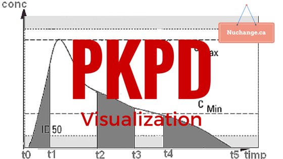
Pharmacokinetics (PK) is what the body does to the drug (elimination or redistribution). Pharmacodynamics (PD) is what the drug does to the body (Its effect). PKPD models conceptually link both into a composite time-effect graph. Calculations associated with this conceptual linking can be quite complicated, but computers simplify this considerably.
Now a brief consideration of the variables in this calculation, again as I understand.
The calculation depends on elimination process, number of compartments, route and the regimen of drug administration.
You need clearance rate (CL), the volume of compartments V1…V3 and the intercompartmental clearance (Q1 & Q2).
A PKPD model can be described as systems of ordinary differential equations in PharmML for the number of compartments and the route of administration.
Now to the emerging concept of population pharmacokinetics:
In the above model, individual variations are not taken into account. You can calculate between-subject variability matrix if you have enough data available from various sources.
Now to the visualization options:
Visualization is important for patients to understand the need for dosage requirements in life threatening conditions like haemophilia and for doctors to plan appropriate dosage regimens.
PKPDSim by Ron Keizer (UCSF) – This is an R library that also provides a model exploration tool that dynamically generates a Shiny app from the specified model and parameters. ODEs for One, two and three model for various routes of administration is available in the library. Custom ODEs and between-subject variability can be defined. Shiny allows interactive exploration of the model, and it also generates the R code for any plot created in the interface. Shiny is R’s web application framework that turns your analyses into interactive web applications.
The example code to run shiny after installing all dependencies is below:
install.packages("devtools", dependencies = TRUE)
install.packages("ggplot2")
install.packages("shiny")
library(devtools)
install_github("ronkeizer/PKPDsim")
library(PKPDsim)

p <- list(CL = 38.48,
          V  = 7.4,
          Q2 = 7.844,
          V2 = 5.19,
          Q3 = 9.324,
          V3 = 111)

omega <- c(0.3,       # IIV CL
           0.1, 0.3)  # IIV V

sim_ode_shiny(ode = "pk_3cmt_iv",
              par = p,
              omega = omega)
Simulx: (A R function of the mlxR package for computing predictions and sampling longitudinal data from Mlxtran and PharmML models.). Details are available on their website: Here is a PKPD example for warfarin. Simulx also supports interactive visualization through Shiny
Plotly is an innovative Canadian startup founded by Alex Johnson, Chris Parmer, Jack Parmer, and Matt Sundquist headquartered in Montreal, Quebec. Plotly is an online analytics and data visualization tool that has a variety of tools such as API libraries for various programming languages, and a javascript library. Plotly may be the ideal tool for fast visualization of PKPD data.
To sum up:
R libraries and hosted shiny applications may be ideal for physician level PKPD interface. plotly may be ideal for prototyping patient education tools that can be later converted into a web application using the various APIs.
P.S. Shiny example for PKPDsim is not functional at the time of writing. Ron has promised to fix it soon.
- Word to LaTeX: How paperajcli Bridges Two Academic Worlds - May 5, 2026
- When GenAI Ideas translate to practice with DHTI - March 4, 2026
- How DHTI Makes MCP Practical for Healthcare Through “Docktor” (Part IV) - February 4, 2026